
Color Harmony in Handmade Jewelry Design
The same beads can look completely different in new combinations. Design more balanced jewelry with color families, complementary and neutral colors, metal tones, and texture.
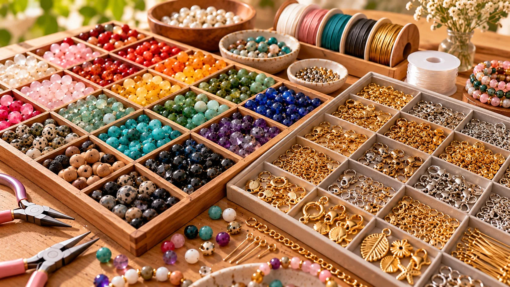
In handmade jewelry design, color harmony is just as important as material selection. The same beads can look completely different in new combinations. With a few basic principles, you can create more balanced necklaces, bracelets, and earrings.
1. Start with a single color family
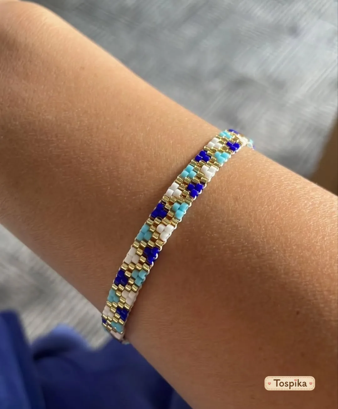
Different shades of the same color create a harmonious look. By bringing together light blue, medium blue, and navy beads, you can create a calm, cohesive design. This approach is especially useful for beginners. iBead Canada notes that mixing different finishes, textures, shapes, and sizes adds interest to monochromatic designs.
2. Try complementary colors
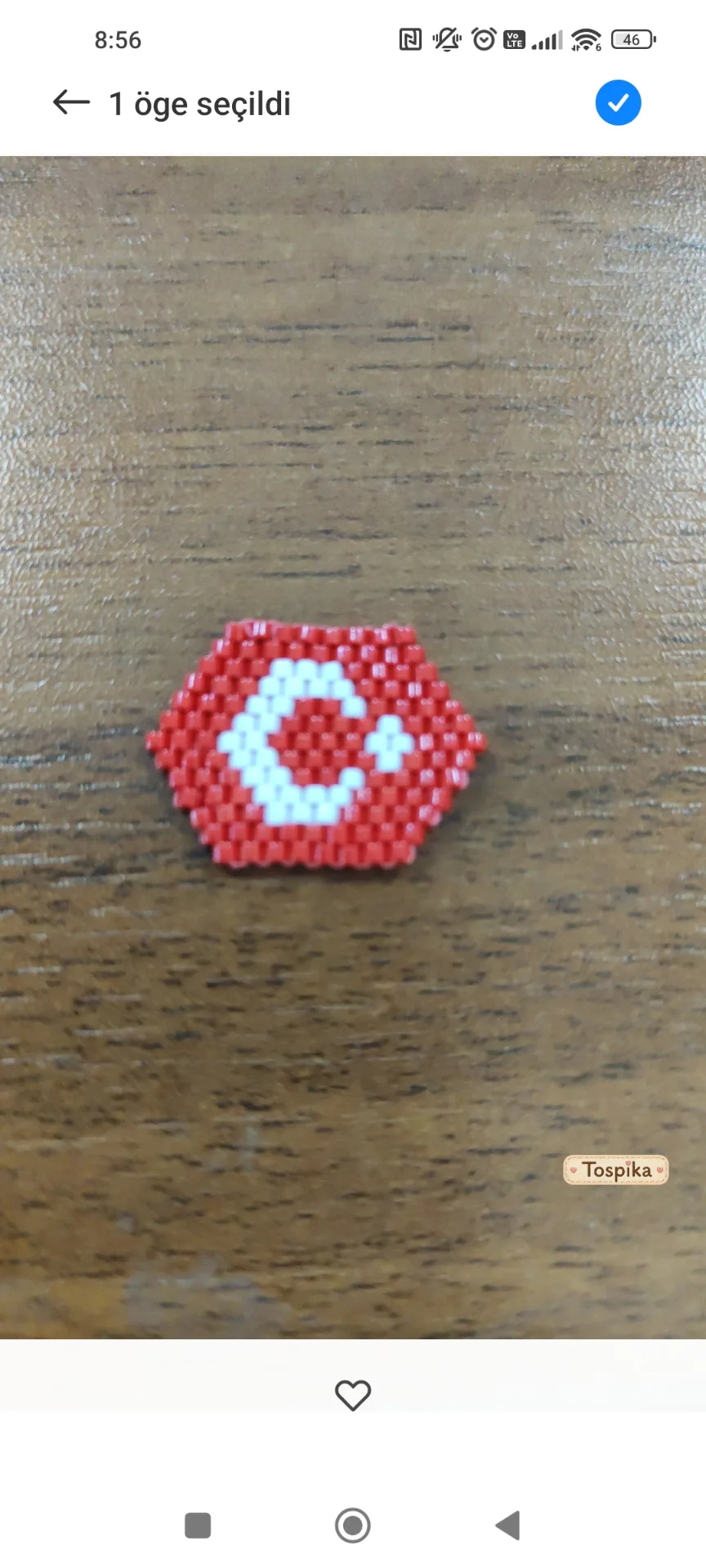
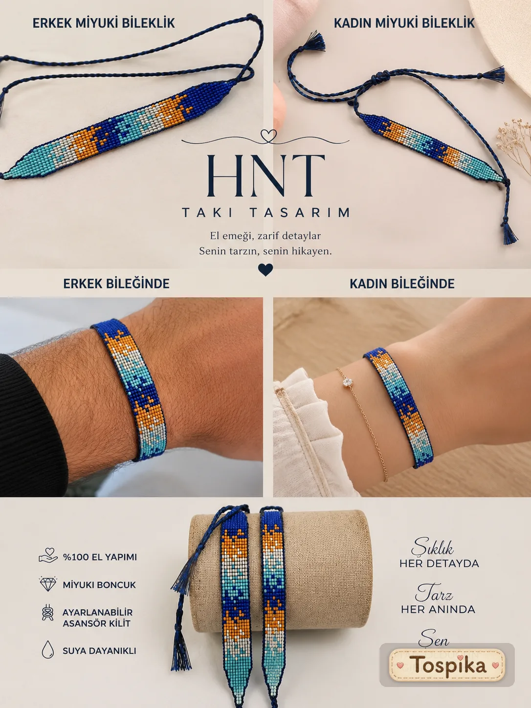
Colors opposite each other on the color wheel can create a strong contrast. Blue and orange, or purple and yellow, are examples. For a balanced result, use one as the main color and the other as an accent; iBead Canada also recommends using the complementary color in small amounts rather than in equal proportions. Colors next to each other on the color wheel, known as analogous colors, offer a palette with softer transitions.
3. Create balance with neutral tones
Cream, white, black, gray, and natural wood tones pair well with many colors. Adding neutral beads between vibrant colors creates visual balance. Combining turquoise with cream-colored pieces can be a good place to start.
4. Choose metal tones thoughtfully
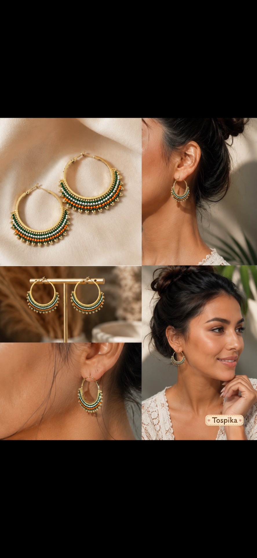
Gold, silver, bronze, and copper tones influence the character of a design. Warm metal tones can create a classic feel, while silver tones can lend a more modern effect. Potomac Beads considers metallic tones such as gold and silver to be neutrals that pair with almost any color. These are not strict rules; try different combinations to find your own style.
5. Consider texture too
Matte, glossy, textured, and transparent beads can look different even when they are the same color. Combining matte ceramic beads with glossy glass beads adds depth to a design.
6. Create a small color palette
Before stringing the beads, place them side by side and experiment:
- Main color: Defines the overall look.
- Supporting color: Complements the main color.
- Accent color: Draws attention in small areas.
Examine the materials in daylight, as lighting can change how colors are perceived. When you begin making your jewelry, you can use a color wheel as a starting point, as Interweave suggests.
7. Take inspiration from nature
Earth, leaf, and cream tones offer a natural look. Ocean blue and sand tones can create a fresh palette, while orange, burgundy, and brown can bring warmth. Let these combinations inspire your jewelry sets.
Mistakes to avoid
- Using too many colors at once.
- Overlooking the texture of the materials.
- Trying to make every element stand out at the same time.
- Choosing colors based only on how they appear on screen.
Conclusion
A sense of color harmony develops with practice. Try different palettes, place materials side by side, and observe what appeals to you. To try your first palette, begin with our guide to making bracelets with beads, and explore the color combinations in the beaded necklaces by women makers on Tospika. Tospika is not involved in the sales or payment process and does not charge commission.
Frequently asked questions
- How many colors should I use?
- There is no fixed number. Starting with two or three main colors can make coordination easier.
- Can gold- and silver-colored findings be combined?
- Yes. Repeating both finishes in different parts of a design can make the mix feel intentional.
- Which colors suit natural stones?
- It depends on the stone's color, texture, and design style. Neutrals work with many stones, while contrast colors create a bolder look.
- What are analogous colors?
- Colors that sit next to each other on the color wheel, such as blue, blue-violet and violet. They create a softer look than complementary pairs.
- Can I trust colors on a screen?
- Not entirely. Screens and lighting can change how colors look, so compare beads side by side in daylight when you can.
Sources
- 6 Color Theory Tips to Enhance Your Beading Designs — Potomac Beads (2024-02-23) potomacbeads.com · Accessed: 2026-10-19
- History of Colour Theory and Using Colour — iBead Canada ibeadcanada.com · Accessed: 2026-10-19
- How to Use a Color Wheel for Your Beading Projects — Interweave (2012-08-07) interweave.com · Accessed: 2026-10-19
Related content
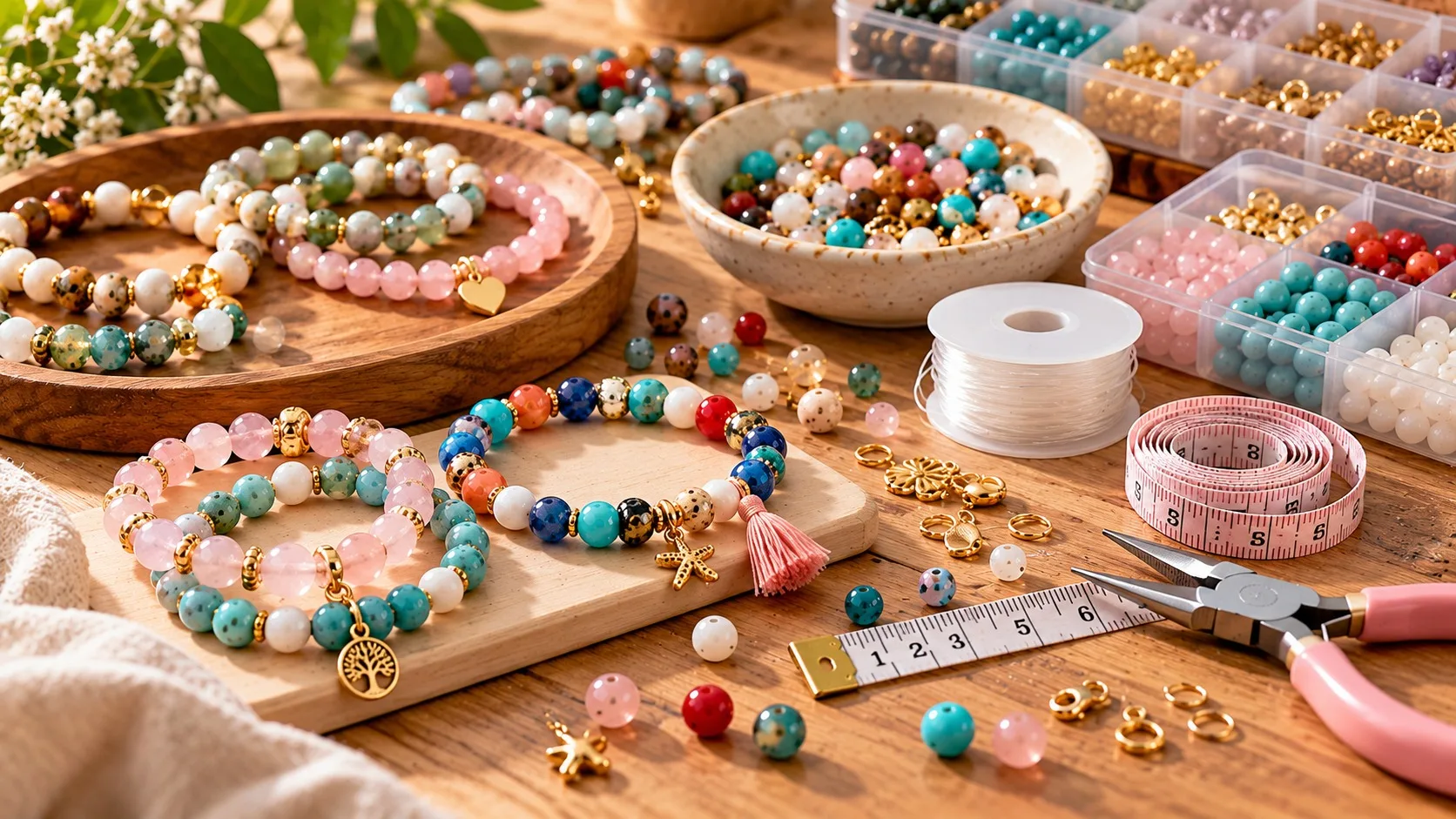
How to Make a Beaded Bracelet: A Step-by-Step Guide
A beaded bracelet is an easy and enjoyable introduction to jewelry design. Follow each step, from measuring your wrist to tying a secure knot.
Read more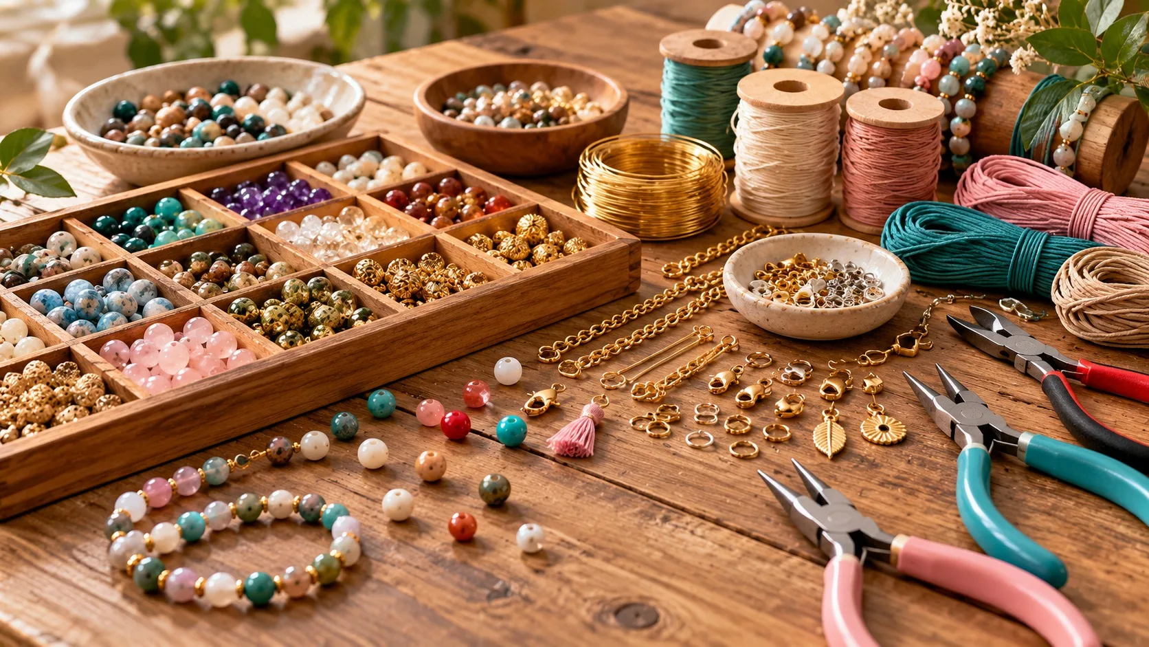
Essential Jewelry-Making Supplies for Beginners
You do not need a professional workshop to begin making jewelry. Learn about beads, cords, findings, and essential tools, then create your first piece with a small starter kit.
Read more