How to Choose Favor Colors and Designs for Your Event Theme
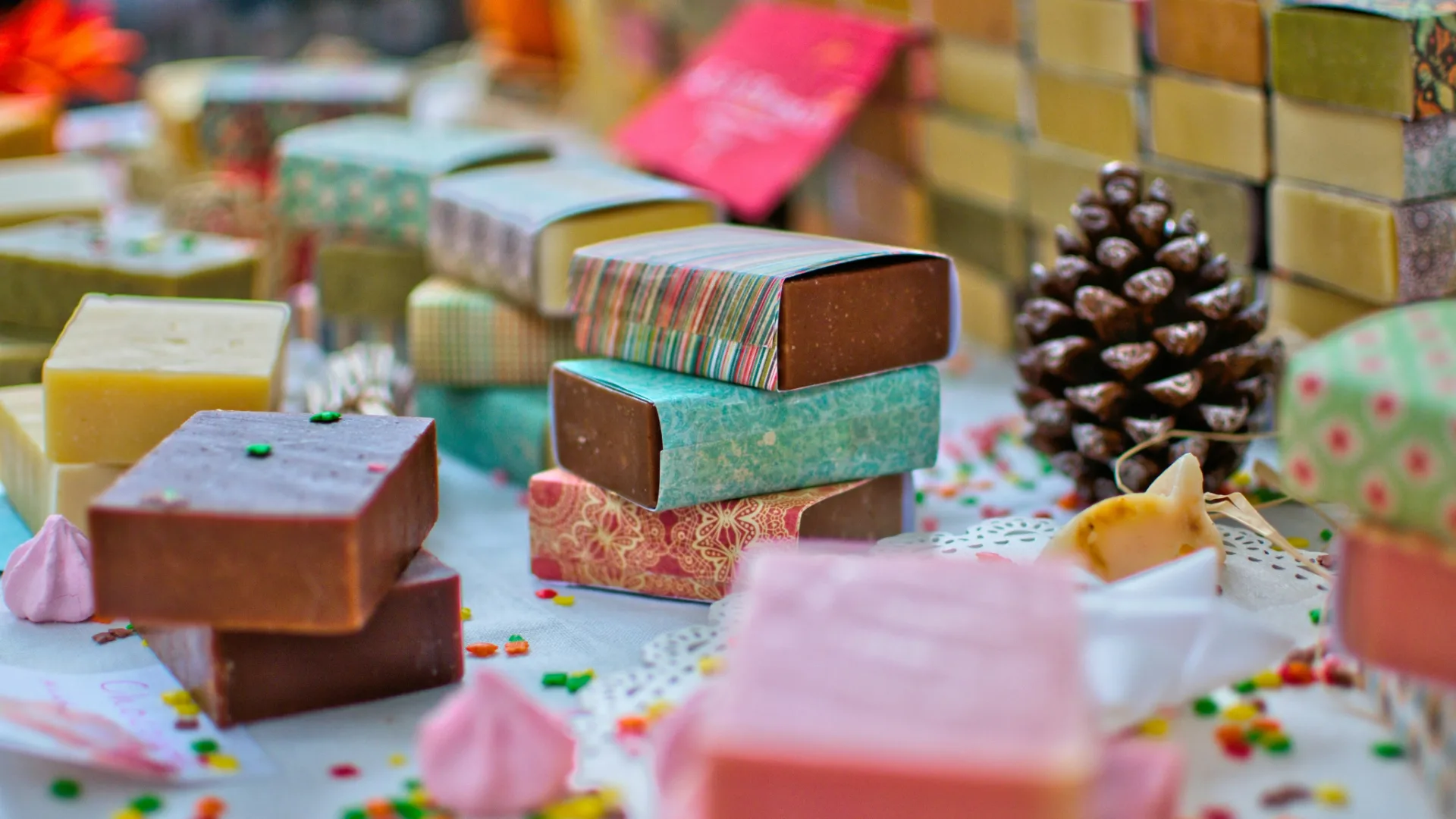
Matching the theme does not mean making every detail the same color. The goal is to create a visual relationship among invitation, table, flowers and favors.
Use a three-part palette
Choose one main shade, one neutral and one small accent. Sage, cream and gold; burgundy, blush and copper; or navy, white and silver create balanced combinations.
Consider the season
Florals and light tones suit spring, fresh shades suit summer, earth and copper work in autumn, while dark green, burgundy and metallic details feel strong in winter. Treat these as starting points, not rules.
Let the venue guide the model
Dried-flower bottles and natural textures suit garden settings; pearls, satin and metallic details complement ballrooms; minimally labelled candles work for simple civil ceremonies.
Think about photographs
Tiny text and similar shades may disappear in photographs. View the favor with the table linen and plates. Sharing venue and invitation images helps the maker suggest a coherent design.
Explore handmade pieces in different colors and styles. Ask the maker directly about customization; Tospika does not manage the sale.